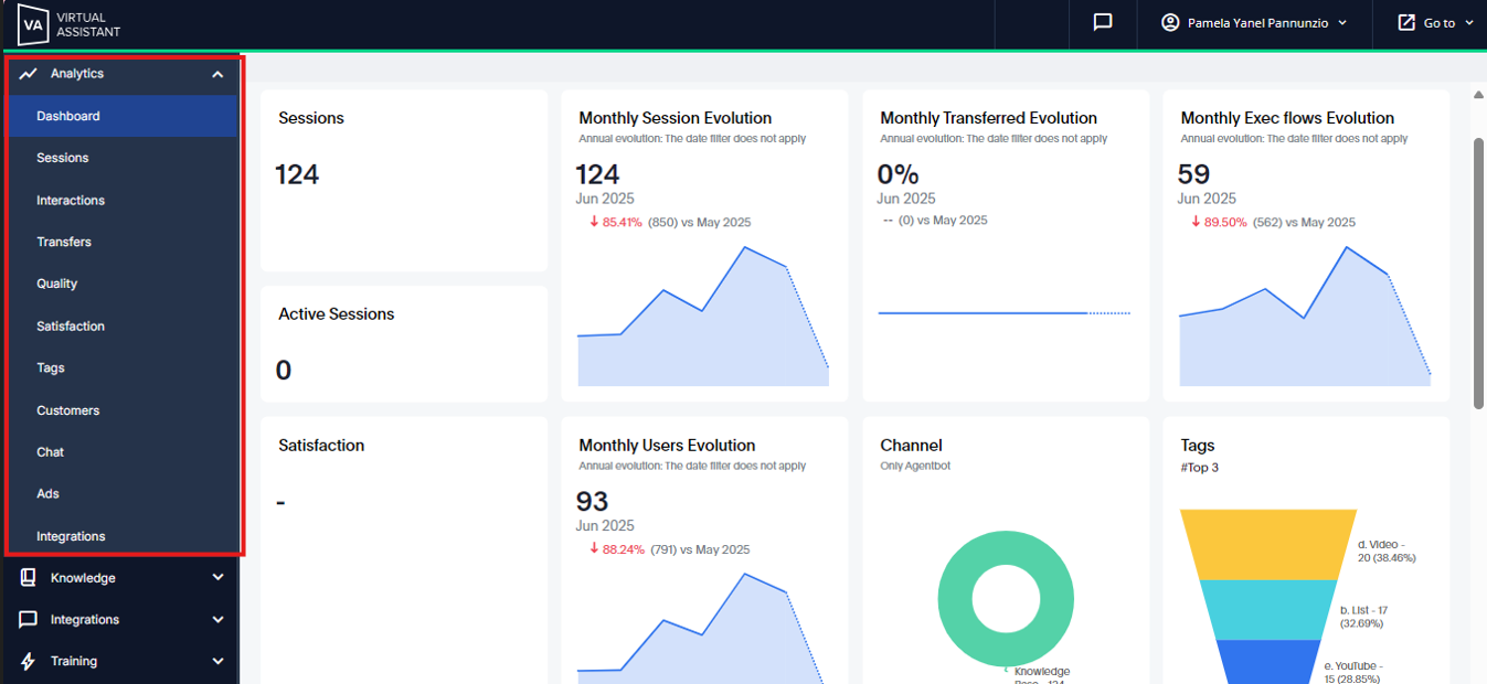
Here, you can find the modules listed in the drop-down menu for easy access.
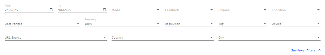
Within each filter header, there are various options enabling you to cross-reference data and assess the performance of your virtual assistant based on different variables.
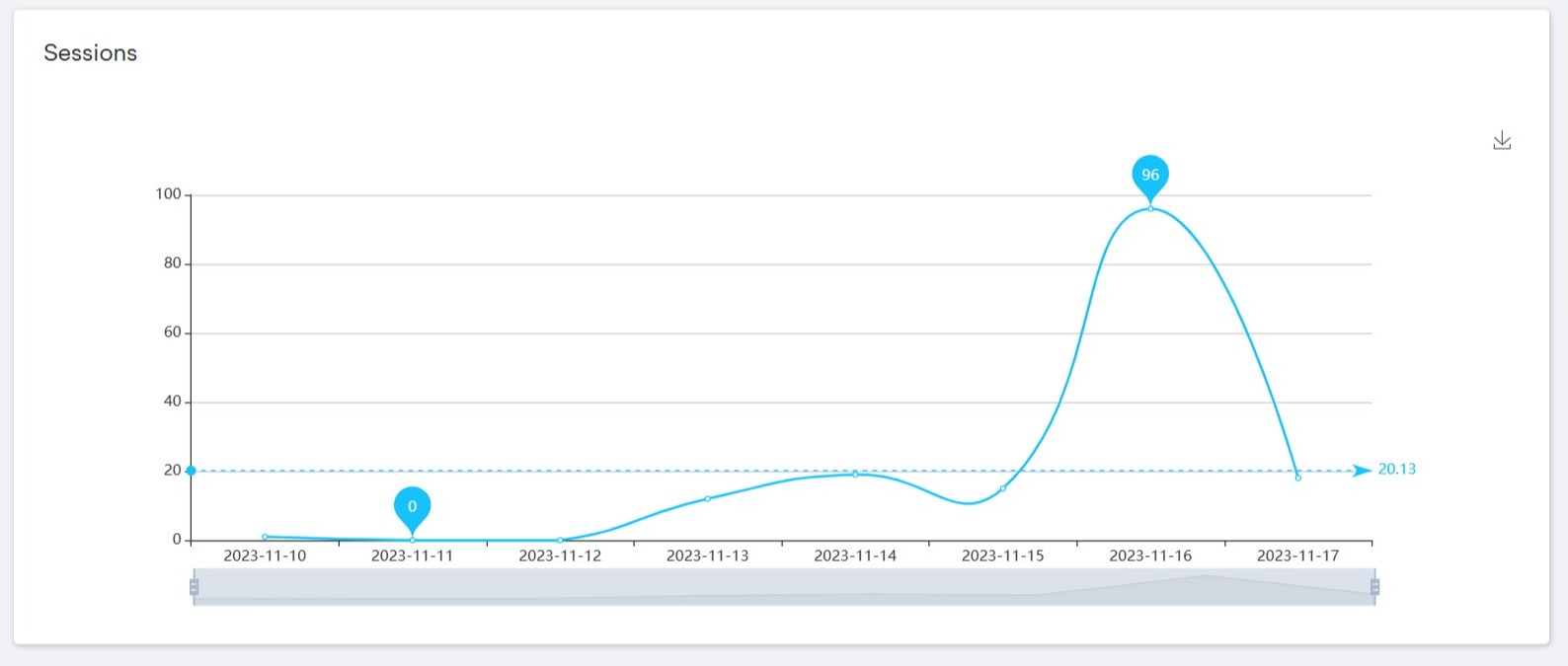
You can view the data in graphs that aid in analysis and offer valuable insights in a user-friendly format. The graphs can be downloaded in .png format using the arrows located on the right side of each graph.
The bar graphs show comparisons between different elements, such as the attention of the virtual assistant on different days of the week. You can adjust the frequency of the data displayed by using the bottom bar of the graph to focus on a specific date. The graph also displays the maximum and minimum limits, as well as the average recorded.
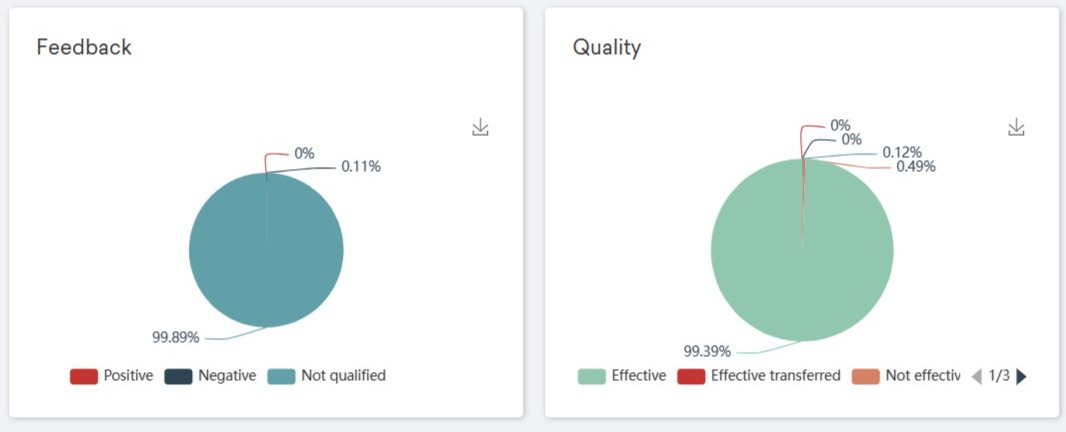
Through pie charts, you can notice the percentages or proportions.
Below, you will find a table that displays data for the selected period based on the filters you have chosen. The information presented can be further analyzed to gain insights.
If you wish to download the tables, simply click on the "Generate Report" button and they will be available in .csv format.

 Important: A link will be automatically sent to the e-mail address of the user requesting the download, through which a .zip file containing the corresponding documents will be accessed.Important: the link received in the email expires after 24 hours for security reasons. In case it takes longer, you will have to download the report from the platform again.
 The Dashboard and Integrations modules have a different user interface.